Friday, December 27, 2013

General update,tiles and finalising

It has been a long time since posts. Since last post, we have completed all of our contract signings and are now just awaiting land titling. First up we had the final contract signing with Metricon. At which, we still did not have a finalised and fully accurate set of plans put in front of us. These changes have been made but it was a tad alarming that given so much time this was not sorted out before contract date.

The next week saw us finalise our tiling choices and a bleed over from our contract issues was that the tiling people did not have the correct surface areas, or correct plans to work with. Our updated laundry, for instance, was completely wrong and we had to fight a little to get the new extended bench top put in, with full overhead cupboards. This was, as you can imagine, annoying, though we were very well tempered about it. After all, we have had much practice already with things not being as they should be.

We contemplated a glass splashback in the colour shown above. Then we were won over by the eggshell tiles also shown here. We opted for an expanded tiling area up either side of the rangehood too. As a result it is a good job we liked the tiles better, as the splashback option was going to be thousands! Instead, with the kitchen tiles, some standard inclusion tiles for the laundry and some nice big bathroom tiles previously shown in the blog we came in well under anticipated cost for the tiling section of the house. This was a pleasant surprise and change from usual.

Since then not much has happened. We have been told the land should title in April, though after looking at the groundworks as we have passed a few times that seems a long way off. The only other thing was a spectacular save by Kylie. Whilst looking at someone else's Breeze-Blog, she noted that their pantry door seemed tiny, and it also had a cavity sliding door. So we looked into things and it turns out that whilst the fridge would have made it into the pantry and its designated space without the door, the door offered to us would have prevented this from being so. A couple of phone calls later, in which the idea of selling a pantry with fridge space but too small a door was ridiculed in good nature, we have had a post contract variation made to allow us to increase the door size so that our standard size (small!) fridge can reach its future home.


Monday, October 14, 2013

Glazing options

One of the things that we (and by "we" we mean Adam) have been after since first looking at building a house, is double glazing. Double glazing serves 3 purposes. Firstly, it keeps the heat in in the cold, reducing energy usage for heating and thus saves baby animals and the planet in general. Second, it can reduce heat getting in reducing the need somewhat for cooling apparatus to be run. Lastly, it serves to reduce noise from outside. Whilst not an issue due to traffic where we are, there is the possibility of noise from neighbours.

The response to our requests for double glazing has been odd. Especially for someone who was born and raised in England. There, double glazing is the norm, and we can double glaze anything as far as I am aware. Here in Australia, people look at you a bit funny if you say you want it as standard through the house. Then after the accede to your wishes, they tell you that the glaziers can't do the stacker or sliding doors as this would make them too heavy... Either Australia is significantly behind the rest of the world in glazing technology or the average Australian is very weak... we will assume the first reason.

With our Metricon build progressing through planning we decided to address the issue once more and requested a quote to double glaze the whole house. This came to a cost of approximately $5000. However, again, the stacker doors cannot be done. What is most frustrating is that these doors are the largest expanse of glass in the build and are on the North and West aspects of the property. Cynthia, (our Metricon contact) is double checking to see if there are any alternative glazing options, and if not will try to make them feel suitably ashamed of the limited options...


Our Studio M appointment

In the journey from "ooh lets build a house", through "lets build this house" to hopefully "aha, that's our house", there are a number of appointments one must have with a builder like Metricon.
We have four. The Studio M appointment, Electrical appointment, Contract signing and Tiling appointment.

The first is, in many ways, the biggie; here you pick colours throughout the house (and external) bricks, fittings, carpet etc etc. Expect a Studio M appointment to talk about 3 and a half hours for the prepared and closer to 5 I would guess for those who are not. We knew what we wanted in almost all cases so we took a bit less than 4 hours.

The big alterations to our original plans were due to a few things. 1) The unfortunate realisation that the silk finish we wanted for our laminate in the kitchen and wet areas was not a standard (we obviously misunderstood something on our brief tour a month or so ago). 2) We upgraded the carpet, that had been a bit of an unknown before going into the appointment. 3) We made a change to the pantry, replacing on section of shelving with a bench. 4) We have asked for a quote on a replacement wooden front door. 5) Our final big change was the decision to upgrade our skirting and architraves somewhat as we felt the basic and "tall" basic layouts did not make sense next to our upgraded internal doors.

We also got a quote for blinds to the windows (excluding the main living room where we want to do something different). However, after doing some research we have decided to do the blinds ourselves and not go with the Metricon associated supplier.

Our choices list went something like this:
External colours: Category 2, Brown Terrain Bricks from Boral with natural rolled mortar. Charcoal grey rooftiles and a "labassa" exposed aggregate driveway. Guttering and downpipes were in Jasper, which matches the powdercoated aluminium window frames. The Fascia will be Evening Haze and the cladding in Barnfloor, with the render as Candlebark. The timber frames and door will be Rich Walnut. The wood finish sectional overhead garage door will be the Mediterranean style in the darker stain Caoba.
Our external colours
Interior colours and fittings survived the process mostly unchanged from what we thought we would choose:
We went with one of the many many colours of white (Whisper White) for the doors, skirting and Architraves. White Swan, another variant of white, will be the walls and ceilings. We only saw the main fittings for the taps etc online as the range had been changed since our last visit to StudioM. Seemed pretty similar and we were happy enough. We chose a rain head for the en suite shower, again from online, and are awaiting a price. The caesarstone stayed as Linen, and we went with the silk finish moleskin, despite the cost, for the kitchen, bathroom, powder room and en suite.
Our carpet upgrade came about as a result of education on the life expectancy of the basic Category 1 selection, and a good poke at it. We upgraded to a Category 3 for the hard wearing status Miniscule (colour34) in part as it was Australian made, and coupled this with an underlay upgrade.
Our carpet on the right, next to our tile choice
We upgraded the Skirting and Architraves to colonial, but the taller type than shown below we also went with a slightly different door to originally chosen, one with texture.


That was most of the upgrades, except for a coupe of locks here and a handle or two there. Our only other addition was the decision to add an additional reverse cycle system in bedroom 3.

We are just waiting for a final costing taking into consideration the pantry alteration, showerhead, and a change to the front door that we are waiting on. A couple of days later, we drove past the land and it looks like they are moving soil about and have marked out the lots!


Saturday, September 28, 2013

Our kitchen plans

These are photos of the Breeze 25 display home kitchen and butler's pantry:

Ours will, of course, look nothing like this, with no bulkhead, the basic pantry layout of shelving all the way around, a sliding door on the pantry and no built in microwave oven and coffee machine. There will be extended bench space and overhead cupboards in place of the built in unit there at the end of the bench near the pantry. We have opted for drawers on either side of the oven (so two sets of three drawers) and then single cupboards on the ends. The oven/stove top has been upgraded to an upright Smeg unit, with a Smeg rangehood as well.


We will have a tiled splashback in lieu of the window behind the stove, 20mm Caesarstone bench tops and an under mount sink without the stone between the sink bowls, as is shown in this picture (this was a great suggestion made to us; washing big pots and other awkward dishes can chip the stone between the bowls- thanks for the tip Robert).


We immediately liked the stone benches in the display home- Linen- so are going to use this for the kitchen bench tops, powder room, bathroom and ensuite counter tops as well. It was a toss up between that and Osprey at first (both Category 1), but the Linen fits much better with what I have always had in mind for a kitchen, and means everything won't look stark white in the bathrooms, with white basins, toilets etc. I also worry about stains on something so pale, which happens no matter how careful you are.

When we visited Studio M, we were given a sample of the Ice Snow Caesarstone as it is close in colour to Osprey and they were out of that one. However, because we wanted to match our choice to laminex samples for the cupboards (and eventually tiles), I got on the Caesarstone website (http://www.caesarstone.com.au/) where you can request up to 4 samples, and had them send out Linen, Osprey, Latte and Ginger for us to check out. They are still small samples, but useful for initial colour decisions. When you visit Beaumont Tiles, they have the slightly larger samples that Studio M has, which helps when choosing tiles.

The colour scheme we have so far:
Caesarstone: Linen (Category 1)
Laminex: Moleskin


All up, we have included less than $2000 worth of kitchen upgrades. We will know for sure after our Studio M appointment and when the contract is finally drawn up.

Friday, September 27, 2013

Initial Ideas

There were a few things that we wanted to do, or not do, that required little to no thought when first planning the house. 

First up, flooring. Standard flooring in the Breeze is tiled flooring downstairs; this had to go. In place of cold, hard, icky tiles we could choose between; laminate flooring, bamboo, or engineered timber (in ascending cost). We opted for bamboo, in part as it was on special and came in at a reasonable ~$7000. Of course that is in a colour that we like too, with darker sections throughout.
Our preferred Bamboo option (on left): "Carbonised antique" - burnt and old....
Next was lighting. We haven't done our official electrical appointment yet but were eager to not opt into down-lights through the house. This is for several reasons. The initial cost of installing down-lights can be huge, thousands for a full set. They are not exactly the most energy efficient beasts either and we don't fancy high running costs. LED down-lights are better, but if you are running your lights in banks of 2, 4 or 8 to get coverage of the room it still adds up. We have down-lights in our current rental and opt to use lamps day-to-day as we find it cheaper/greener and the ambiance is more cosy. In short, we will have baton lights throughout the house.

We wanted a staircase that had storage underneath it and for it to be solid wood. The default is a heavy MDF staircase with carpet covering. We have upgraded this to the solid timber (which does not have a carpet covering) -cost:$3,250 and added a door and light to access the underneath-cost:$276. As we understand it we will have to stain this ourselves...
Standard on the left - Upgrade on the right (we will have black balustrade bars - standard)

A few interior door changes were planned too. A partition door from the hallway to the main open-plan living area so that we can just heat/cool that area was added. Then we just had to find an interior door that looked a little nicer than the plain standard doors.
Our current interior door choice
We also decided that an internal door from the garage to the laundry was required-cost: $ included in promotion. Speaking of the laundry, there were a couple of immediate changes there. The door to the laundry is a glass sliding door as standard.... with lovely views onto the fence 1m away. We have had this changed to a hinged door so that that corner becomes more utilitarian and so that we can put in a dog door for the "kids", cost:$190. Finally, we increased the cupboard and bench space so that we have somewhere to store various dog related goods and wash said critters, cost:$721.

The only other thing that we chose immediately and did not really ponder over was the driveway. The standard is coloured concrete and we have opted to go with the prettier, and possibly harder wearing, exposed aggregate at a cost of $3,900.

The Living Room

This is the display house living room at Coburg Hill. As with the kitchen, the bulkhead will be absent, as will the fitted cabinets visible on the left. The bi-fold door behind the couch will be a wall with a large window, as we will have stacker doors on the end wall of the lounge area and in the adjacent dining area. We figured one only needs so many exits from the ground floor.

Hopefully this picture conveys some of the reason we opted for the 8.5m block suited Breeze, over the standard 10m wide block builds. On the right hand side you can see the garden wrapping around the building. This acts to make the plot feel more spacious and immediately breaks up the garden space into different zones. Instead of just looking out of the one rear aspect with a full block width house and having tiny windows onto a fence or wall, we will have views from two sides of the living/dining/kitchen space onto our garden. The layout of our house will be the mirror of this with a Northerly rear and the side windows facing West.

Whilst we loved the bi-fold doors, they are very expensive. However, the "middle" option of a stacker door gives you a larger aperture than the standard sliding, and can be more adaptable than the bi-fold. Each stacker was a $450 upgrade (in the case of the dining room door there was an additional cost of $120 to create a sliding door space before this, in lieu of a window).

Wednesday, September 4, 2013

End August / Start September 2013 - Journey underway

At the end of August our journey into home ownership started properly with our deposit on a lot at the Coburg Hill development. We are in the process of determining our building options, but are settled upon a Breeze 25 from Metricon. 

This blog is intended to serve as a catalogue of our progress for friends and family and a repository of information that may help others taking a similar journey. We have found the blogs of others building Metricon homes helpful in our journey thus far. Hopefully we can help others through our experiences.

We are undecided about the blog layout, but are thinking of running things as pages which we will update for major house areas, and a post reel with extra facts/figures/news and updates on the content of those pages.

Sunday, September 1, 2013

The House


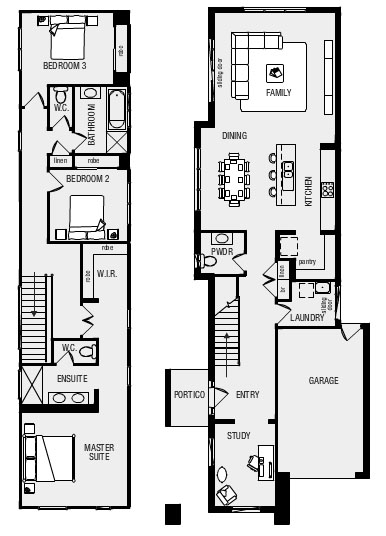
The house that we have decided to go with is a Metricon Breeze 25. It is a two storey build, suited to narrow blocks (8.5m) so it fits very easily onto our 10m plot. To get the internal space the build is quite long at over 21m, however, the trade off is a nice wide side area that we can use for a range of gardening solutions. The above picture is of our preferred facade, the "Traditional".

The Breeze is a 3-bed plus study build as standard. The result is a very luxurious feeling master bedroom suite with an enormous section of corridor. We felt this was a waste of space and have opted to reconfigure the area to place the WIR where the en suite WC is, moving the toilet to inside the main en suite. That way we reduce corridor wastage and get a rumpus in the landing area. Apart from that there are no major structural changes planned.

At the start of September, whilst cruising around the estate looking at brick colours and rendering, we swung by a Breeze that was at frame stage to see what that was like. It is actually the property of another blogger so we will be interested to watch it go up in real life and online. 

Friday, August 16, 2013

The Land

The first phase of our journey is underway. After fighting with the, quite frankly insane, auction system in Melbourne for established properties we turned to buying land at Coburg Hill. Buying a house and land package (or piecing the two together on an estate) has traditionally been looked down on by us. Possibly due to my experiences of estates in the UK and Kylie's experiences of some poorly implemented estates here.

Things at Coburg Hill seemed more promising. First of all, it is "central", being only 9km from the city. We live that distance away and know what that is like, as we are based only 2km due West at present. That closeness, combined with the creek adjacent and the access to bike trails it provides makes it feel very different to other places that we have briefly considered and rejected.

We first looked at a larger block of some 500m square. However, that plot had significant fall, was located as a sole element of the estate on the Northern outer edge, was orientated wrong, and had a bad feel about the neighbouring properties. A shame, as we really wanted a large block to work with so that we could develop a proper garden. However, armed with a trusty tape measure, I discovered that some of the smaller blocks in Stage 5 were actually pretty close to what we presently rent, and if we were clever about the house, we could get a big enough yard out of it.

We settled upon a 322m square lot, put a holding deposit on it and waited. After a few weeks the land was released and with no price hike associated we signed the contracts and moved to pay our deposit. The agent was perfectly happy with us paying a 5% deposit instead of a 10%, something to be mindful of as money in your pocket is always better than in theirs.

The land won't be titled until March 2014 (ish). So it will be a long wait for finalising site costs and the like. However, with the lot "purchased" we can barrel along into planning the build.