Saturday, September 28, 2013

Our kitchen plans

These are photos of the Breeze 25 display home kitchen and butler's pantry:

Ours will, of course, look nothing like this, with no bulkhead, the basic pantry layout of shelving all the way around, a sliding door on the pantry and no built in microwave oven and coffee machine. There will be extended bench space and overhead cupboards in place of the built in unit there at the end of the bench near the pantry. We have opted for drawers on either side of the oven (so two sets of three drawers) and then single cupboards on the ends. The oven/stove top has been upgraded to an upright Smeg unit, with a Smeg rangehood as well.


We will have a tiled splashback in lieu of the window behind the stove, 20mm Caesarstone bench tops and an under mount sink without the stone between the sink bowls, as is shown in this picture (this was a great suggestion made to us; washing big pots and other awkward dishes can chip the stone between the bowls- thanks for the tip Robert).


We immediately liked the stone benches in the display home- Linen- so are going to use this for the kitchen bench tops, powder room, bathroom and ensuite counter tops as well. It was a toss up between that and Osprey at first (both Category 1), but the Linen fits much better with what I have always had in mind for a kitchen, and means everything won't look stark white in the bathrooms, with white basins, toilets etc. I also worry about stains on something so pale, which happens no matter how careful you are.

When we visited Studio M, we were given a sample of the Ice Snow Caesarstone as it is close in colour to Osprey and they were out of that one. However, because we wanted to match our choice to laminex samples for the cupboards (and eventually tiles), I got on the Caesarstone website (http://www.caesarstone.com.au/) where you can request up to 4 samples, and had them send out Linen, Osprey, Latte and Ginger for us to check out. They are still small samples, but useful for initial colour decisions. When you visit Beaumont Tiles, they have the slightly larger samples that Studio M has, which helps when choosing tiles.

The colour scheme we have so far:
Caesarstone: Linen (Category 1)
Laminex: Moleskin


All up, we have included less than $2000 worth of kitchen upgrades. We will know for sure after our Studio M appointment and when the contract is finally drawn up.

Friday, September 27, 2013

Initial Ideas

There were a few things that we wanted to do, or not do, that required little to no thought when first planning the house. 

First up, flooring. Standard flooring in the Breeze is tiled flooring downstairs; this had to go. In place of cold, hard, icky tiles we could choose between; laminate flooring, bamboo, or engineered timber (in ascending cost). We opted for bamboo, in part as it was on special and came in at a reasonable ~$7000. Of course that is in a colour that we like too, with darker sections throughout.
Our preferred Bamboo option (on left): "Carbonised antique" - burnt and old....
Next was lighting. We haven't done our official electrical appointment yet but were eager to not opt into down-lights through the house. This is for several reasons. The initial cost of installing down-lights can be huge, thousands for a full set. They are not exactly the most energy efficient beasts either and we don't fancy high running costs. LED down-lights are better, but if you are running your lights in banks of 2, 4 or 8 to get coverage of the room it still adds up. We have down-lights in our current rental and opt to use lamps day-to-day as we find it cheaper/greener and the ambiance is more cosy. In short, we will have baton lights throughout the house.

We wanted a staircase that had storage underneath it and for it to be solid wood. The default is a heavy MDF staircase with carpet covering. We have upgraded this to the solid timber (which does not have a carpet covering) -cost:$3,250 and added a door and light to access the underneath-cost:$276. As we understand it we will have to stain this ourselves...
Standard on the left - Upgrade on the right (we will have black balustrade bars - standard)

A few interior door changes were planned too. A partition door from the hallway to the main open-plan living area so that we can just heat/cool that area was added. Then we just had to find an interior door that looked a little nicer than the plain standard doors.
Our current interior door choice
We also decided that an internal door from the garage to the laundry was required-cost: $ included in promotion. Speaking of the laundry, there were a couple of immediate changes there. The door to the laundry is a glass sliding door as standard.... with lovely views onto the fence 1m away. We have had this changed to a hinged door so that that corner becomes more utilitarian and so that we can put in a dog door for the "kids", cost:$190. Finally, we increased the cupboard and bench space so that we have somewhere to store various dog related goods and wash said critters, cost:$721.

The only other thing that we chose immediately and did not really ponder over was the driveway. The standard is coloured concrete and we have opted to go with the prettier, and possibly harder wearing, exposed aggregate at a cost of $3,900.

The Living Room

This is the display house living room at Coburg Hill. As with the kitchen, the bulkhead will be absent, as will the fitted cabinets visible on the left. The bi-fold door behind the couch will be a wall with a large window, as we will have stacker doors on the end wall of the lounge area and in the adjacent dining area. We figured one only needs so many exits from the ground floor.

Hopefully this picture conveys some of the reason we opted for the 8.5m block suited Breeze, over the standard 10m wide block builds. On the right hand side you can see the garden wrapping around the building. This acts to make the plot feel more spacious and immediately breaks up the garden space into different zones. Instead of just looking out of the one rear aspect with a full block width house and having tiny windows onto a fence or wall, we will have views from two sides of the living/dining/kitchen space onto our garden. The layout of our house will be the mirror of this with a Northerly rear and the side windows facing West.

Whilst we loved the bi-fold doors, they are very expensive. However, the "middle" option of a stacker door gives you a larger aperture than the standard sliding, and can be more adaptable than the bi-fold. Each stacker was a $450 upgrade (in the case of the dining room door there was an additional cost of $120 to create a sliding door space before this, in lieu of a window).

Wednesday, September 4, 2013

End August / Start September 2013 - Journey underway

At the end of August our journey into home ownership started properly with our deposit on a lot at the Coburg Hill development. We are in the process of determining our building options, but are settled upon a Breeze 25 from Metricon. 

This blog is intended to serve as a catalogue of our progress for friends and family and a repository of information that may help others taking a similar journey. We have found the blogs of others building Metricon homes helpful in our journey thus far. Hopefully we can help others through our experiences.

We are undecided about the blog layout, but are thinking of running things as pages which we will update for major house areas, and a post reel with extra facts/figures/news and updates on the content of those pages.

Sunday, September 1, 2013

The House


The house that we have decided to go with is a Metricon Breeze 25. It is a two storey build, suited to narrow blocks (8.5m) so it fits very easily onto our 10m plot. To get the internal space the build is quite long at over 21m, however, the trade off is a nice wide side area that we can use for a range of gardening solutions. The above picture is of our preferred facade, the "Traditional".

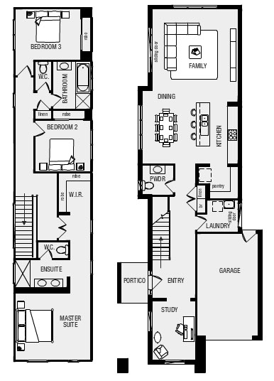
The Breeze is a 3-bed plus study build as standard. The result is a very luxurious feeling master bedroom suite with an enormous section of corridor. We felt this was a waste of space and have opted to reconfigure the area to place the WIR where the en suite WC is, moving the toilet to inside the main en suite. That way we reduce corridor wastage and get a rumpus in the landing area. Apart from that there are no major structural changes planned.

At the start of September, whilst cruising around the estate looking at brick colours and rendering, we swung by a Breeze that was at frame stage to see what that was like. It is actually the property of another blogger so we will be interested to watch it go up in real life and online.